11/27/2025 | 15 minute read
How to Use BeeForm
Complete step-by-step guide on how to use BeeForm to create beautiful, customized Google Forms with themes, design controls, wizard mode, and response management features.
BeeForm is a Google Forms designer add-on that transforms standard forms into beautiful, professional, and highly customizable web forms. If you've ever felt limited by Google Forms' basic styling options or wanted to create forms that match your brand perfectly, this guide will show you how to use BeeForm step by step. With preset themes, granular design controls, wizard mode for multi-step forms, and response management features, BeeForm elevates your forms from functional to exceptional.
- Getting Started with BeeForm
- Step 1: Install the Add-on
- Step 2: Open the Designer
- Step 3: Choose a Theme (Optional)
- Step 4: Customize Your Design
- Step 5: Configure Layout Mode
- Step 6: Setup Form Settings
- Step 7: Save & Publish Your Form
Getting Started with BeeForm
BeeForm is a Google Forms add-on that gives you complete control over your form's appearance and behavior. Unlike standard Google Forms, BeeForm allows you to customize colors, fonts, layouts, input styles, and even add features like progress bars and response limits. The add-on works directly within Google Forms, making it easy to design and maintain your forms without learning complex code.
BeeForm is perfect for businesses collecting customer information, event organizers managing registrations, educators creating engaging surveys, marketers building lead capture forms, and anyone who wants their forms to look professional. The visual designer shows you real-time previews, so you can see exactly how your form will appear to respondents before publishing.
'Design is not just what it looks like and feels like. Design is how it works.' – Steve Jobs
Step 1: Install the Add-on
Open any Google Form and click the More menu (three dots) in the top-right corner. Select Get add-ons to open the Google Workspace Marketplace. Search for 'BeeForm' and click Install. You'll be asked to grant permissions for BeeForm to access your Google Forms and save settings.
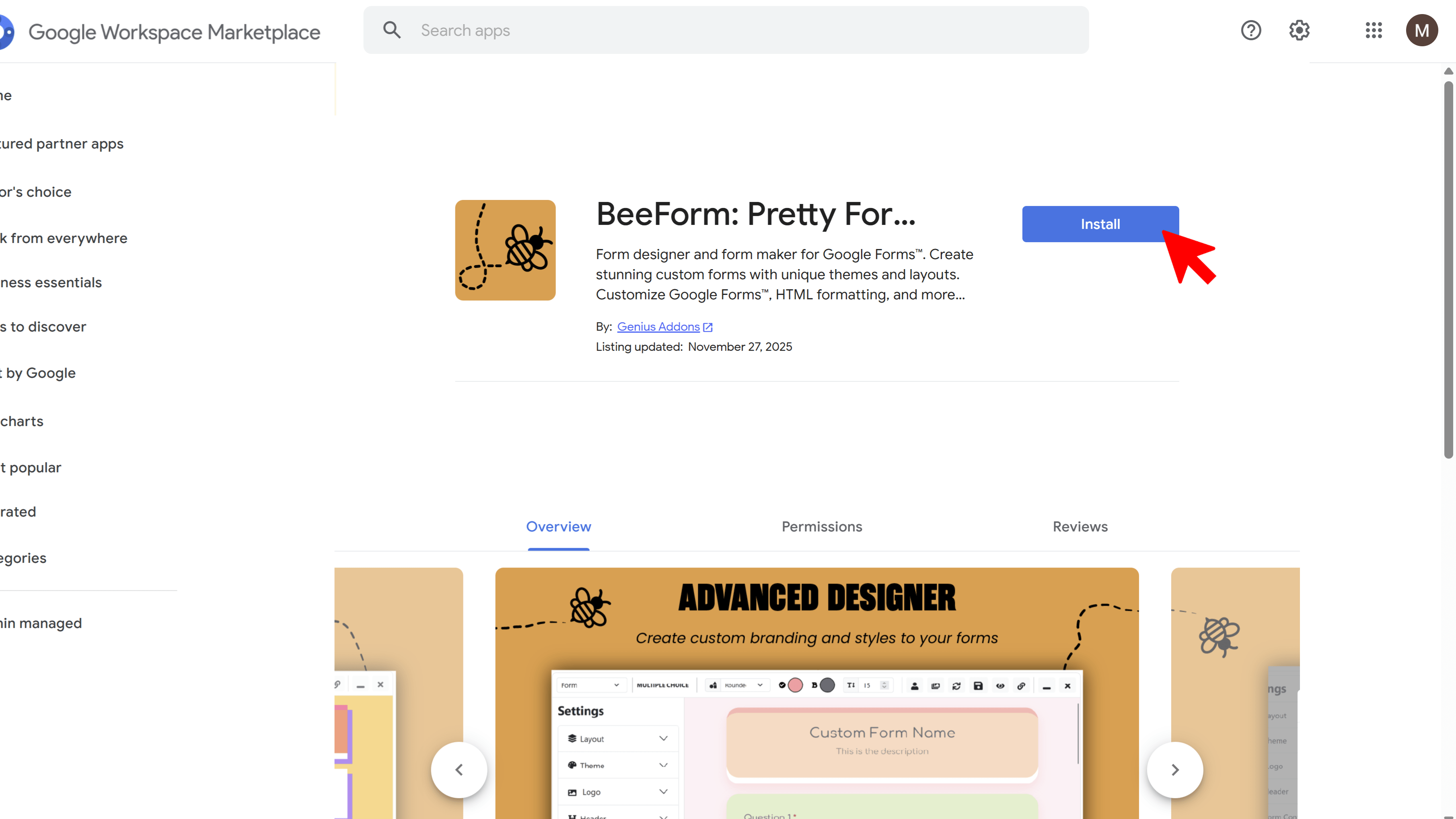
After installation, the add-on will appear in your Google Forms toolbar. You only need to install once it will be available for all your forms.
Step 2: Open the Designer
In your Google Form, click the Add-ons icon (puzzle piece) in the top toolbar. Select BeeForm from the dropdown, then click 🚀 Open App. The BeeForm Designer will launch in a popup window, showing you a live preview of your form alongside customization controls.
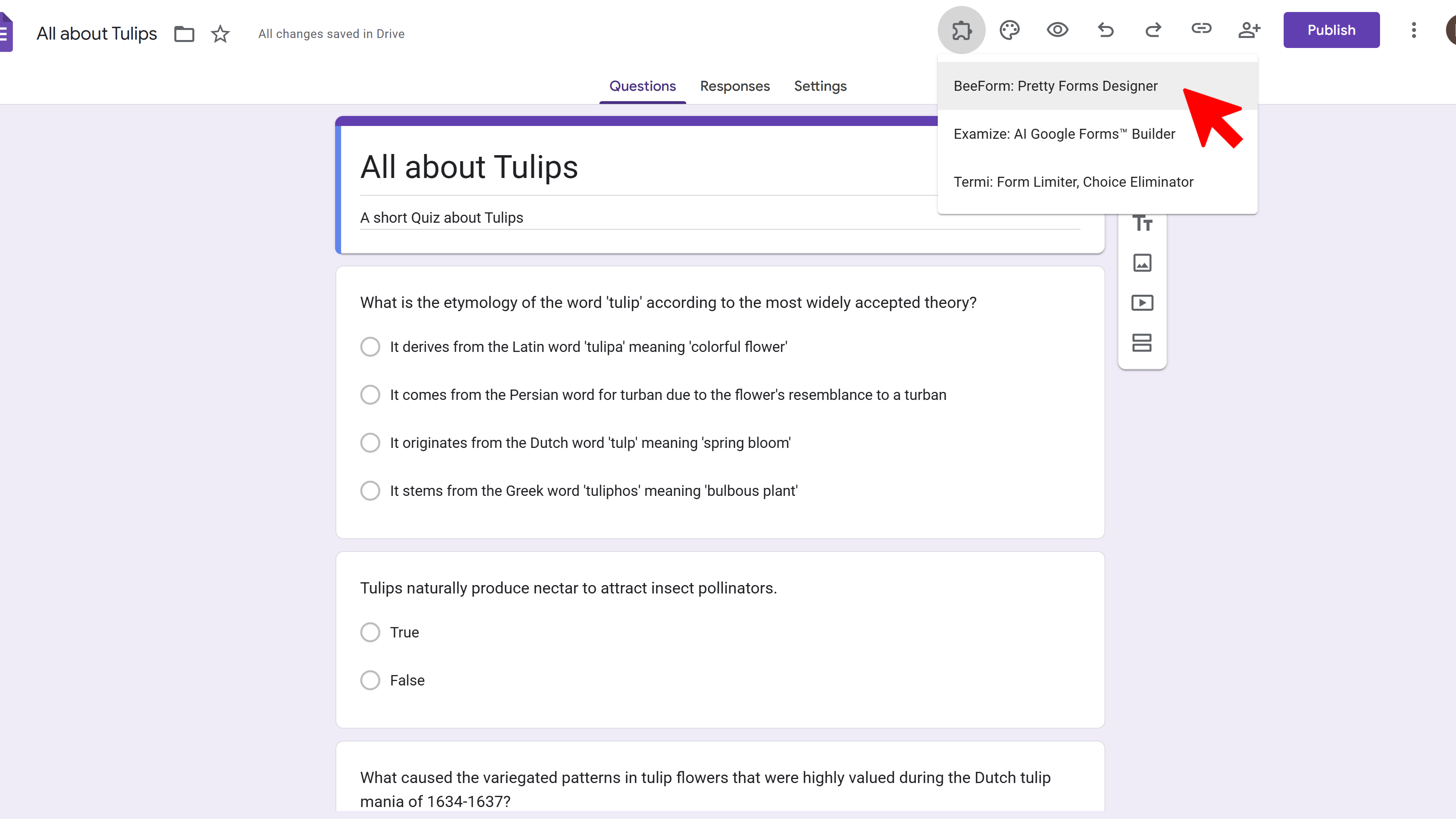
First-time users: You may see an authorization prompt. Click the authorization link, grant permissions in the new window, then return to the Designer and click the Refresh button (circular arrow) in the toolbar.
Step 3: Choose a Theme (Optional)
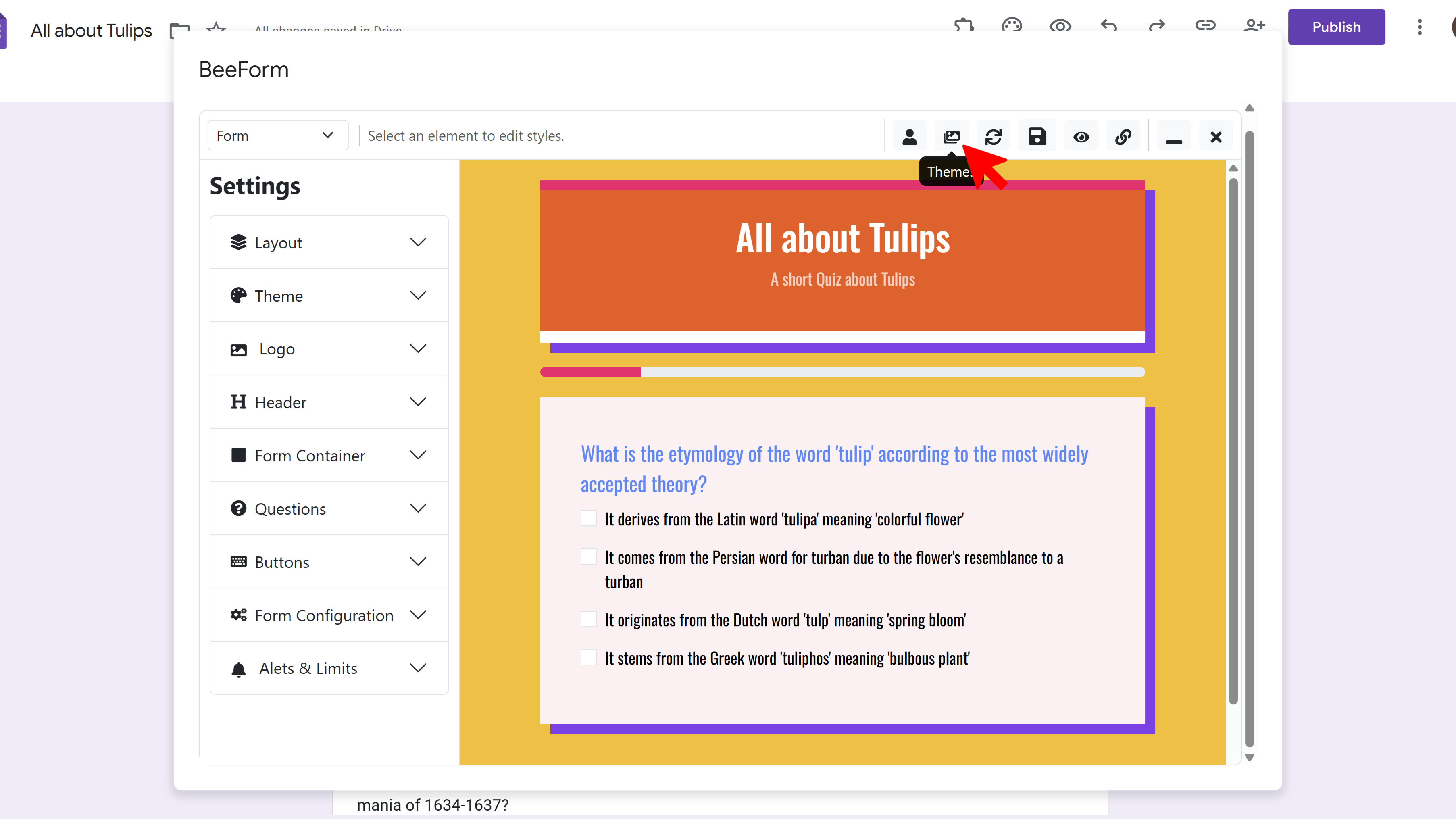
Want to start with a professionally designed template? Click the Images Icon in the toolbar to open the Theme Gallery. Browse through preset themes designed for different industries and use cases corporate, education, events, creative, and more.
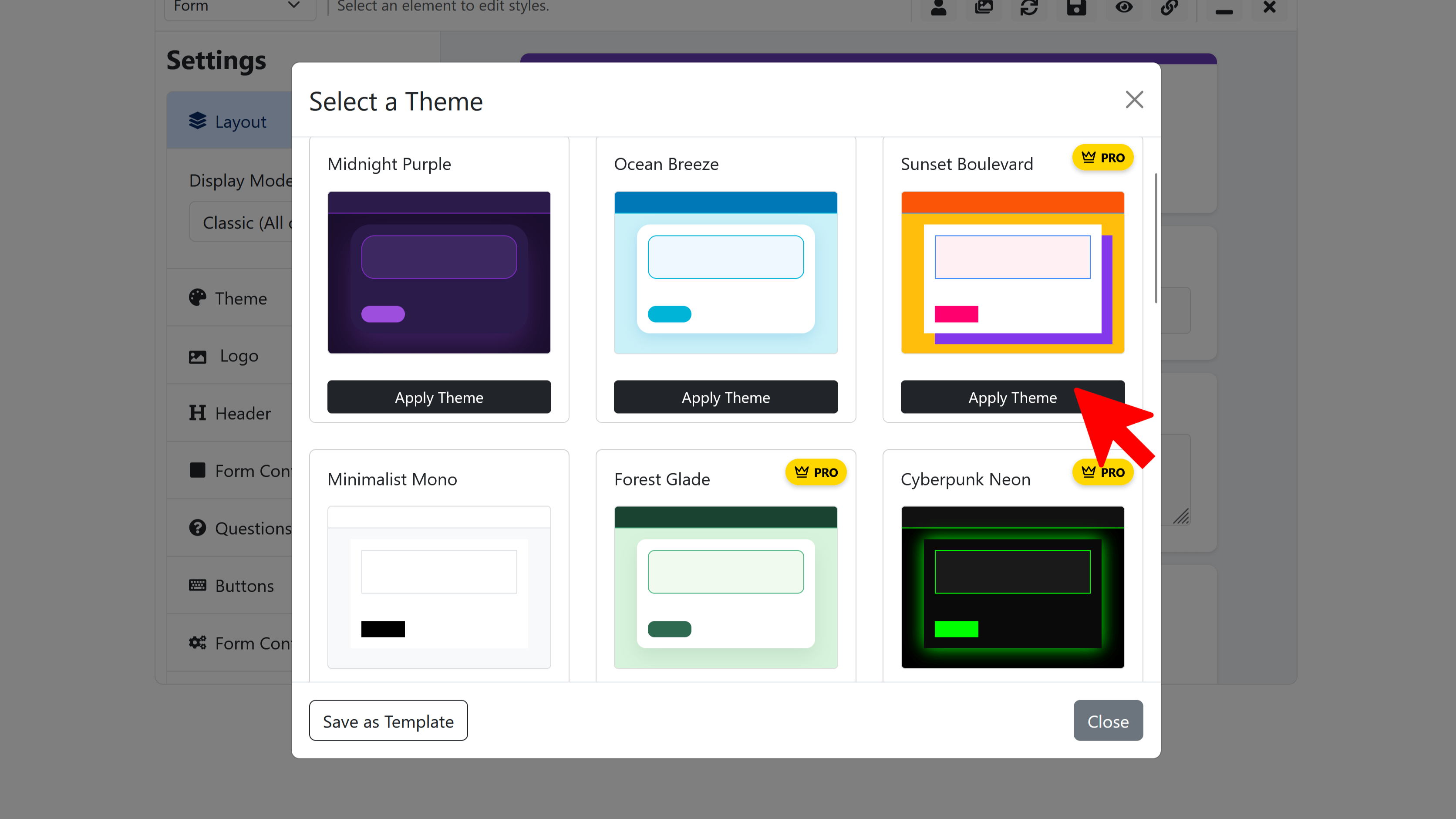
Click any theme to instantly apply its colors, fonts, backgrounds, and styling to your form. Themes are fully customizable, so you can use them as a starting point and tweak individual elements to match your brand.
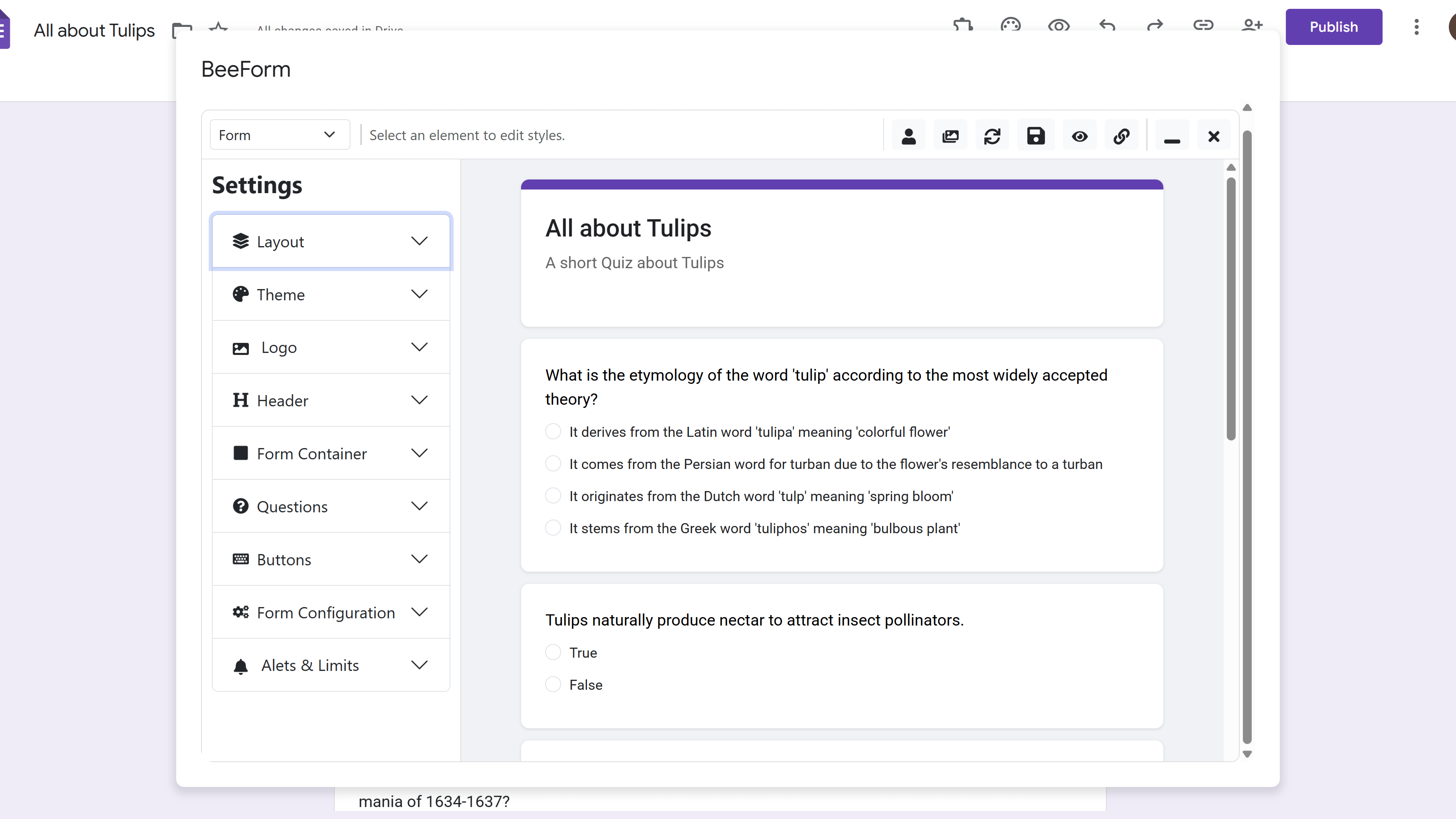
Step 4: Customize Your Design
The Settings Panel on the left gives you granular control over every aspect of your form's appearance. Let's explore the key customization areas:
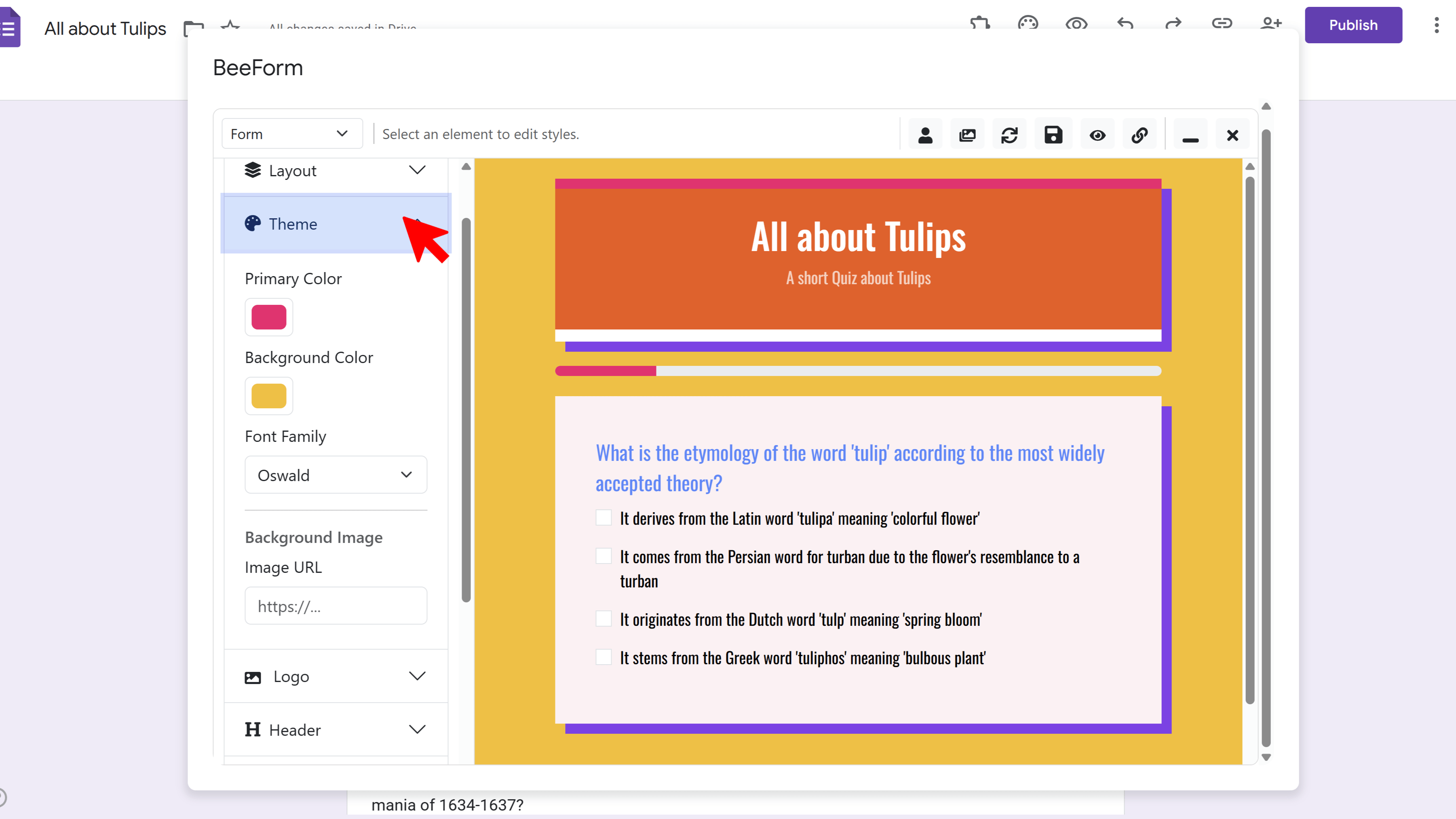
🎨 Global Theme
Set the foundation for your entire form by choosing primary colors, background colors or images, and font families. These settings apply globally unless overridden for specific elements.
- Navigate to Global Theme in the Settings Panel
- Click the color picker to choose your Primary Color (used for accents, buttons, highlights)
- Set Background Color or upload a Background Image
- Choose Font Family from Google Fonts (Roboto, Open Sans, Montserrat, etc.)
🖼️ Header & Logo
Customize the top bar of your form with your brand colors and logo. The header provides context and reinforces brand identity.
- Navigate to Header settings
- Set header background color and text color
- Choose text alignment (Left, Center, Right)
- Upload a Header Image (optional banner or background image)
- Navigate to Logo settings
- Upload your logo image
- Set logo size (Small, Medium, Large)
- Choose position (Top, Bottom, Left, Center, Right)
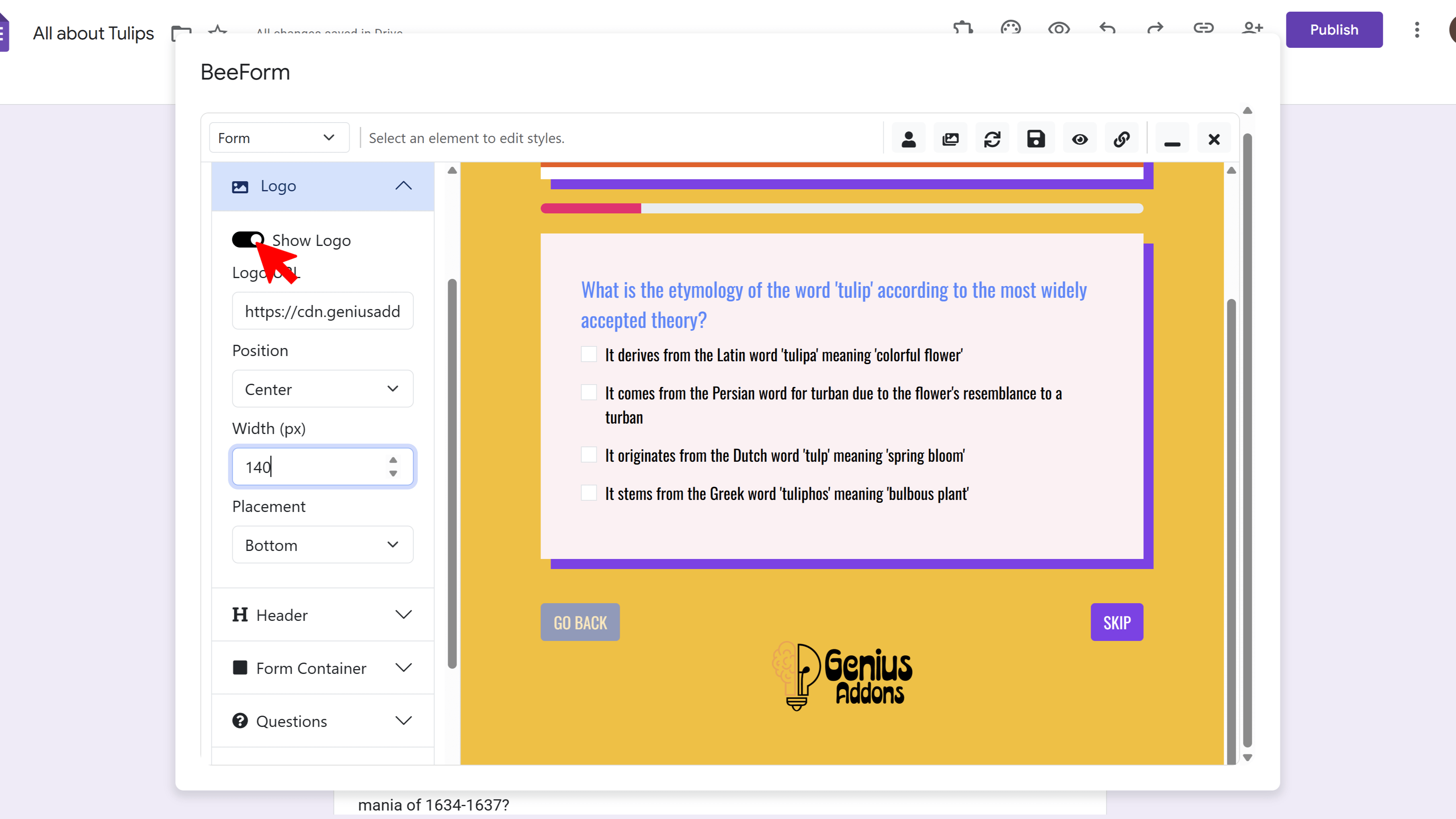
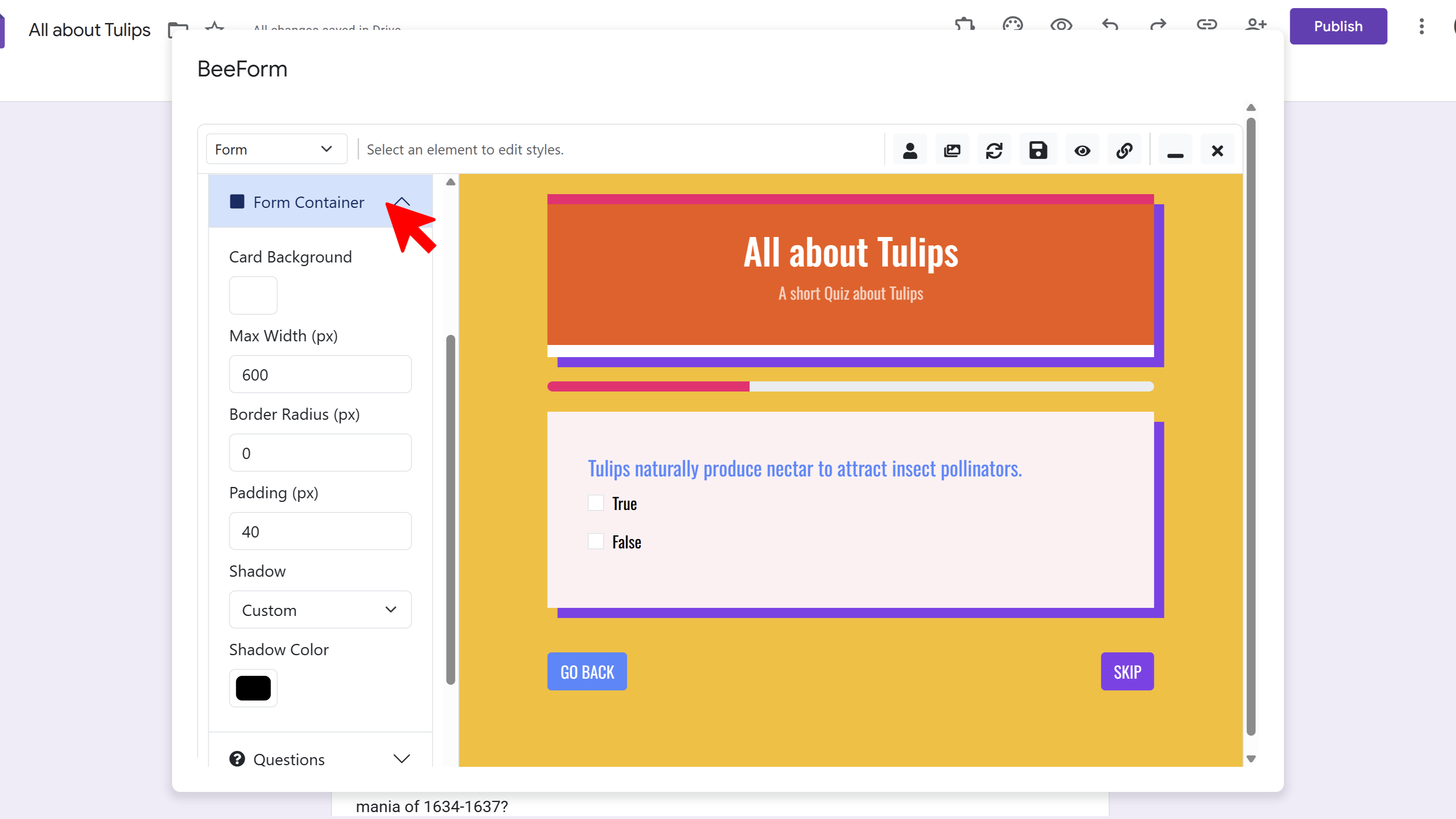
📦 Form Container
Style the main box that contains your form questions. This creates visual separation from the background and improves readability.
- Navigate to Form Container
- Set Background Color for the container
- Adjust Border Radius for rounded corners
- Add Shadow for depth (None, Small, Medium, Large)
- Configure Padding to control spacing inside the box
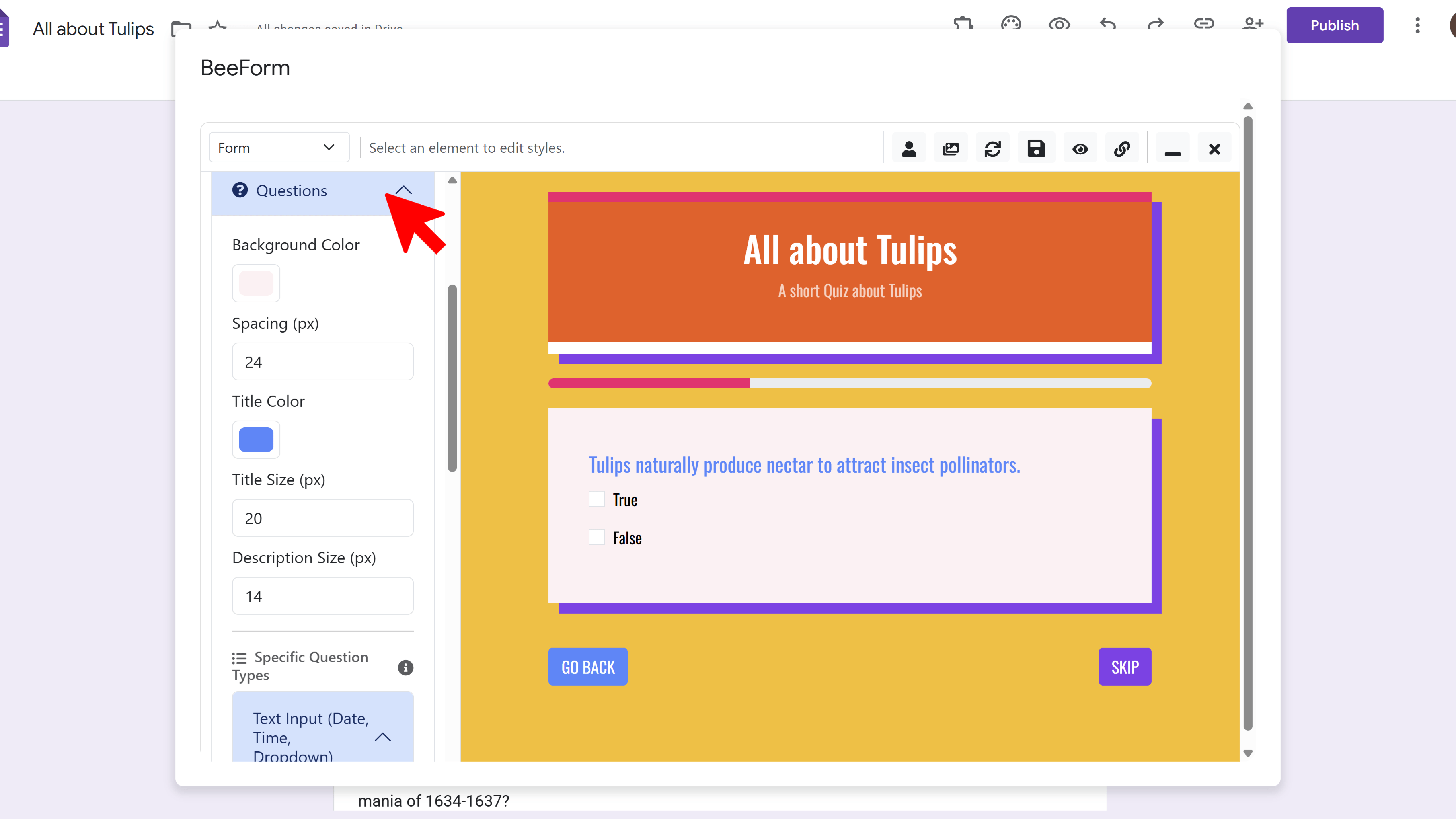
❓ Question Cards
Control how individual questions appear, including backgrounds, text sizes, and spacing between questions.
- Navigate to Questions settings
- Set Background Color for question cards
- Customize Title Size and Title Color
- Adjust Description Size for question help text (if used)
- Set spacing between questions
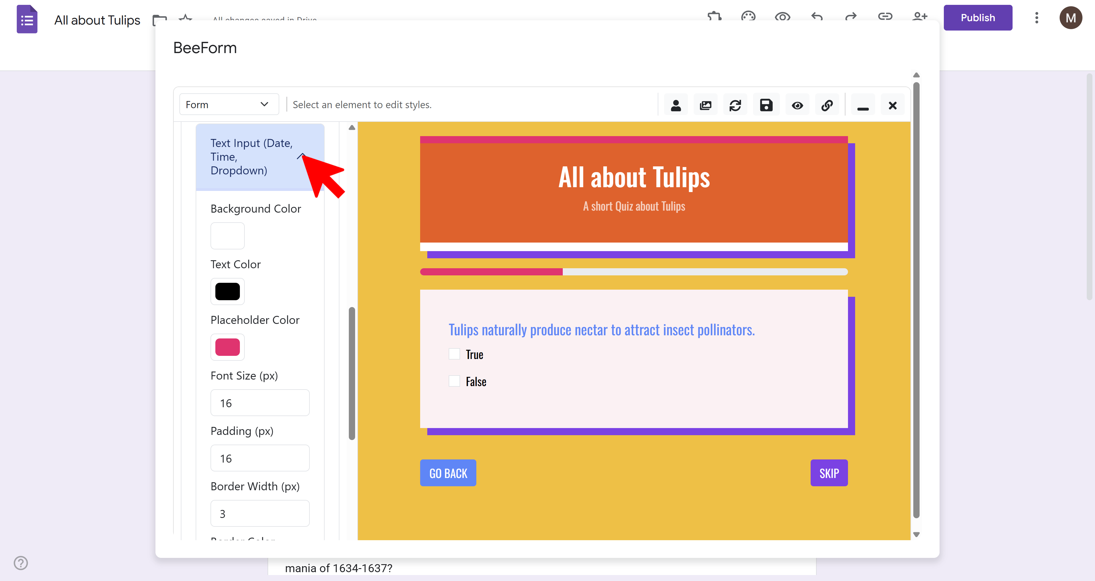
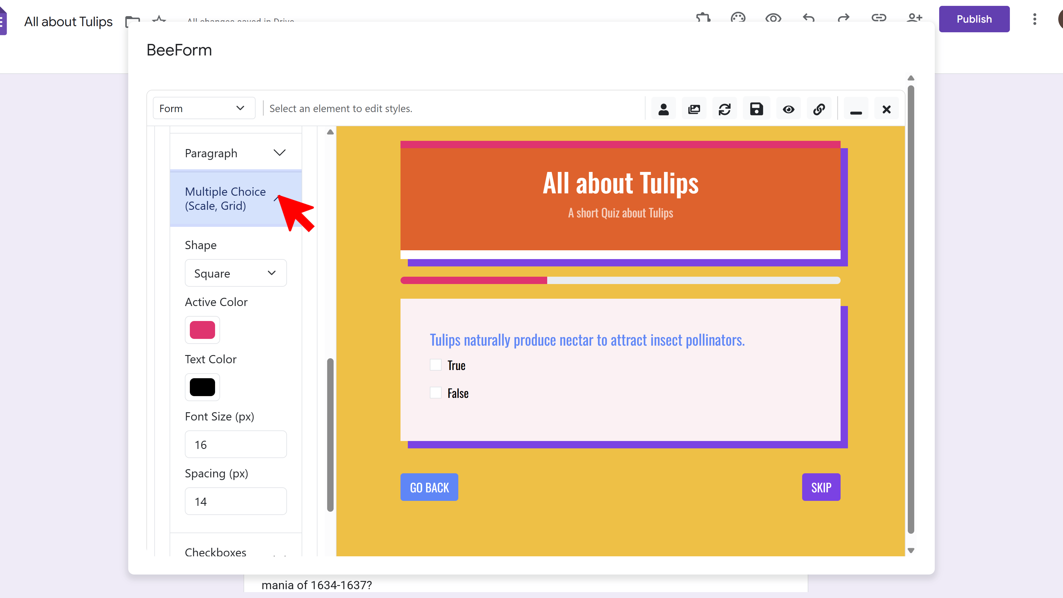
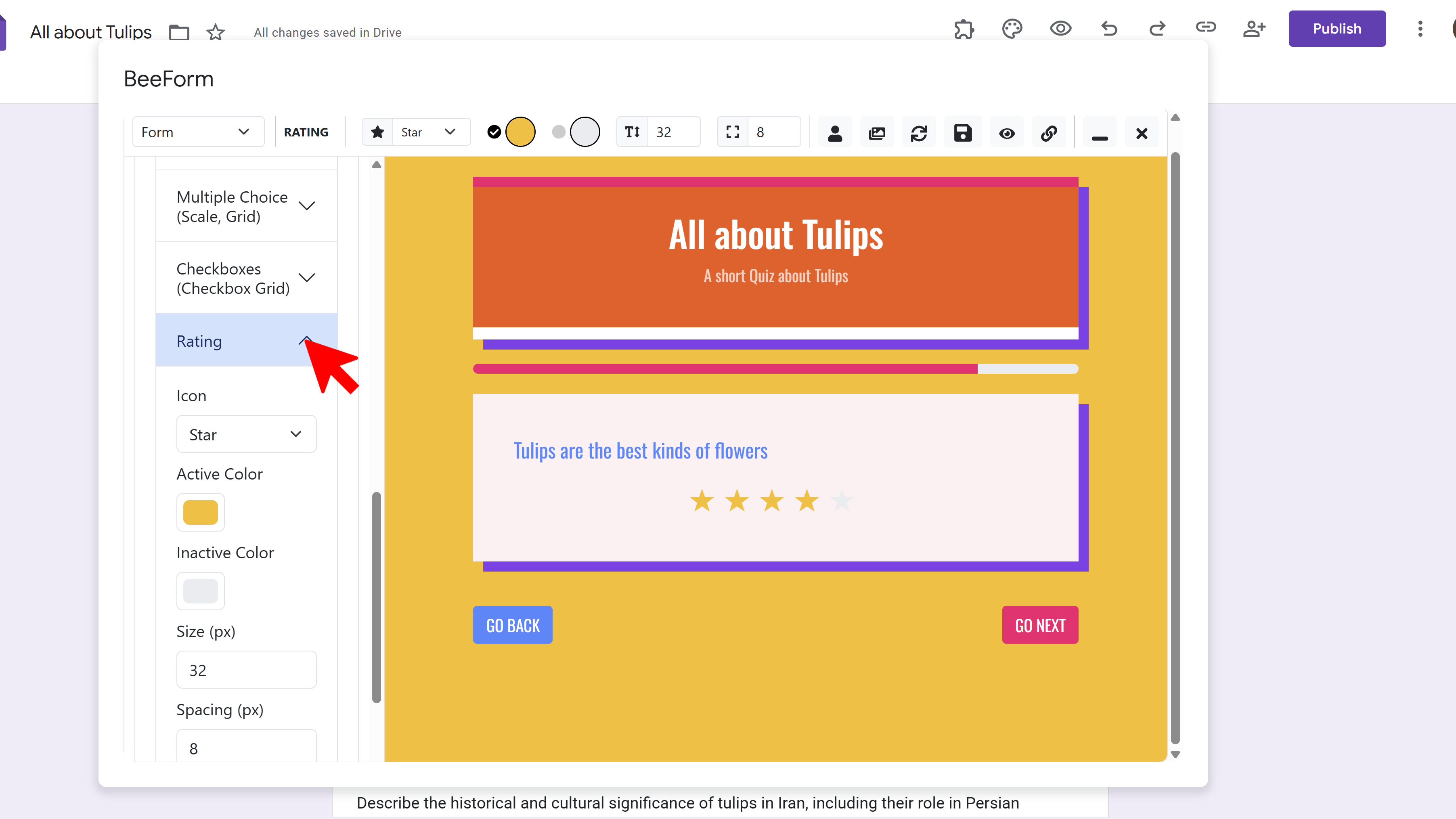
🎛️ Input Styles
Get specific with how different input types look. BeeForm lets you customize text inputs, multiple choice options, checkboxes, dropdowns, and ratings.
Text/Paragraph Inputs:
- Change input background color
- Set border color and thickness
- Adjust text size and color
- Add placeholder text styling
Multiple Choice / Checkboxes:
- Choose Shape: Circle, Square, or Rounded for radio buttons/checkboxes
- Set Active Color (when selected)
- Set Inactive Color (default state)
- Adjust spacing between options
Rating Scales:
- Choose Icon Style: Stars, Hearts, Squares, or Circles
- Set Active Color (filled icons)
- Set Inactive Color (empty icons)
- Adjust icon size
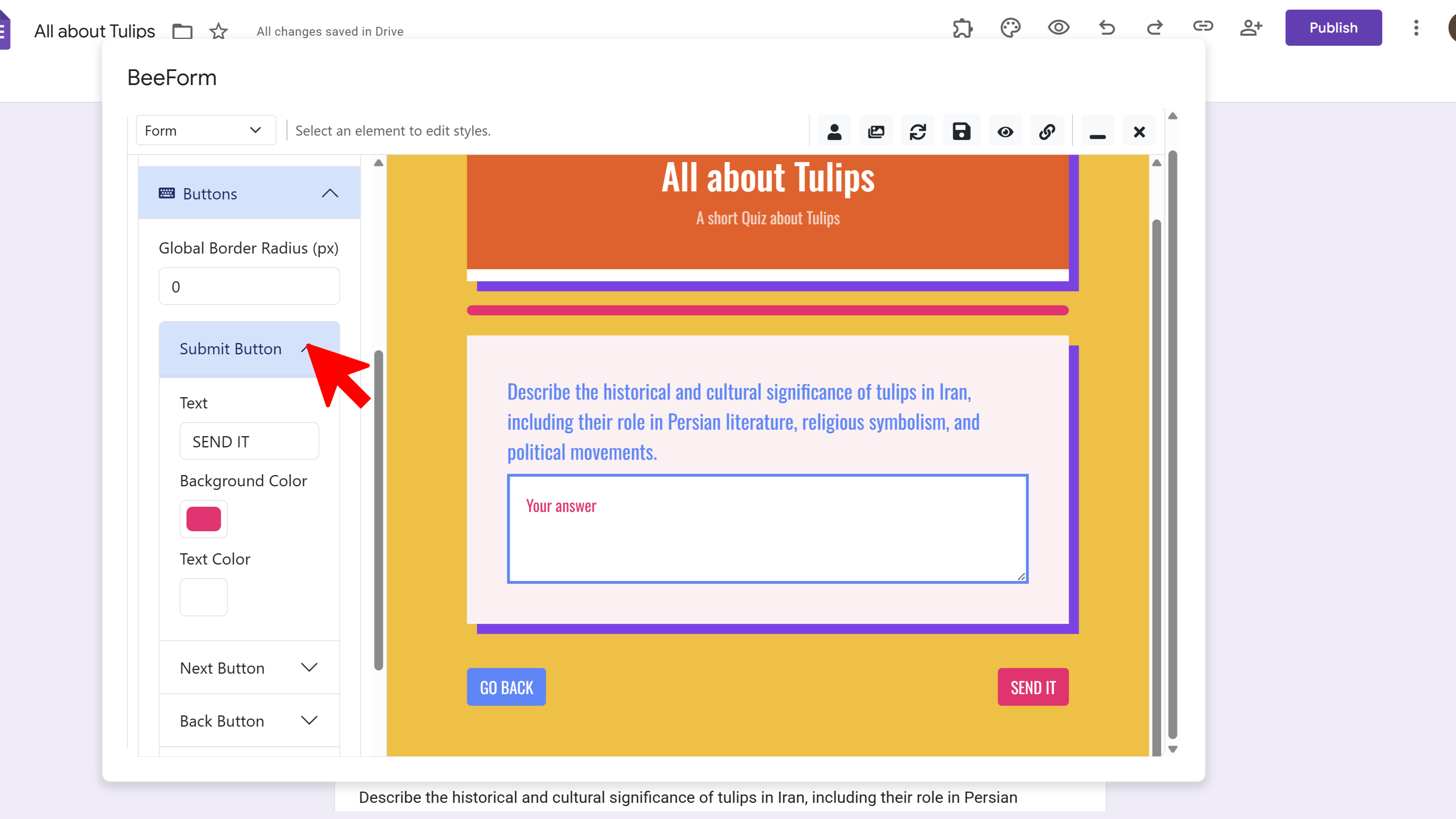
🔘 Buttons
Customize all action buttons in your form: Submit, Next, Back, and Skip. Make them stand out and match your brand.
- Navigate to Buttons in Settings Panel
- For each button type (Submit, Next, Back, Skip), customize:
- Button Text (change the label)
- Background Color
- Text Color
- Border Radius (square to fully rounded)
- Border Color and thickness
Step 5: Configure Layout Mode
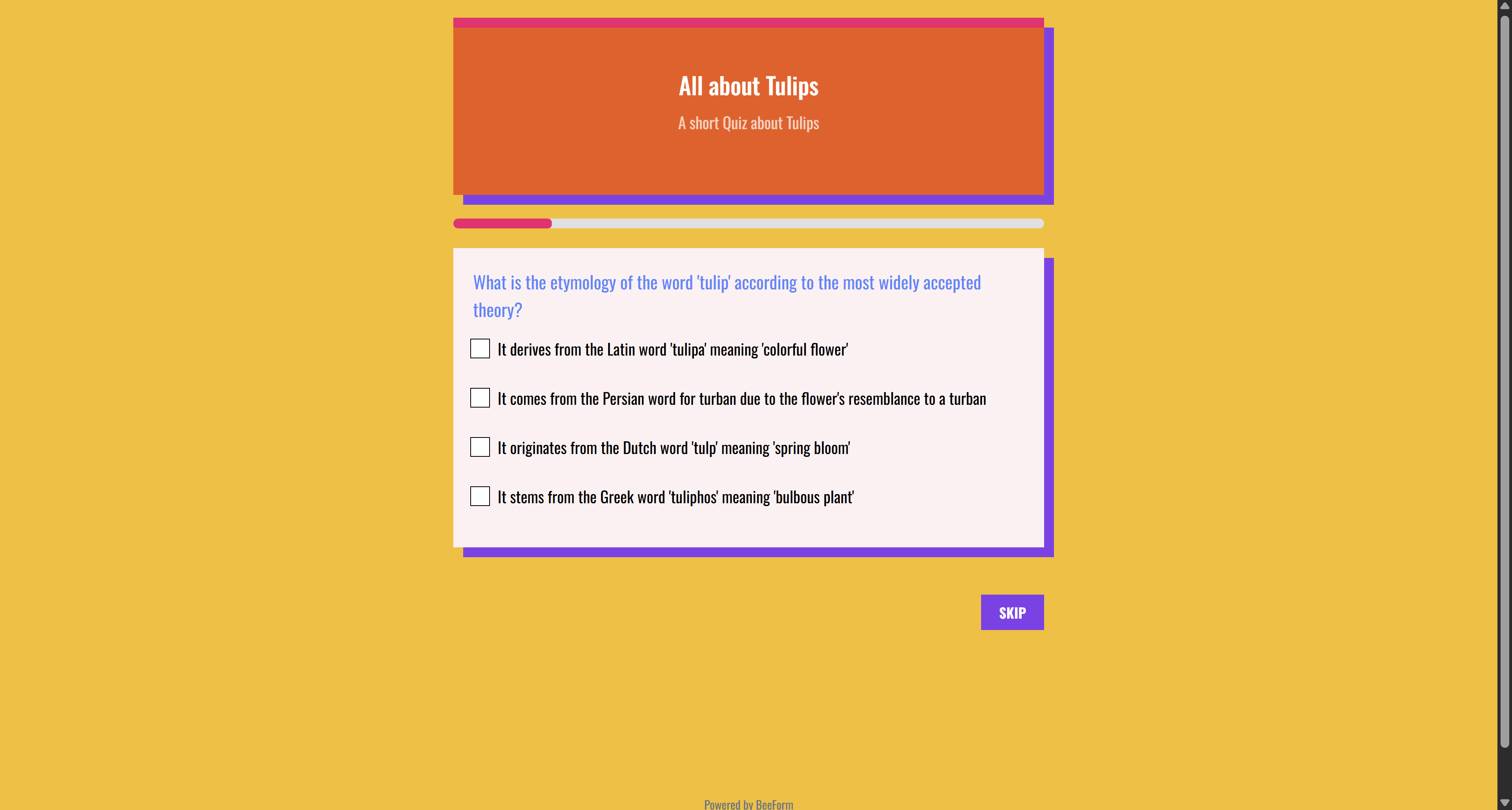
BeeForm offers two distinct layout modes to control how questions are presented to respondents:
📄 Classic Mode
Displays all questions on a single scrollable page (or follows Google Forms' section breaks if you've created sections). Best for short forms, contact forms, simple surveys, or when you want respondents to see all questions at once.
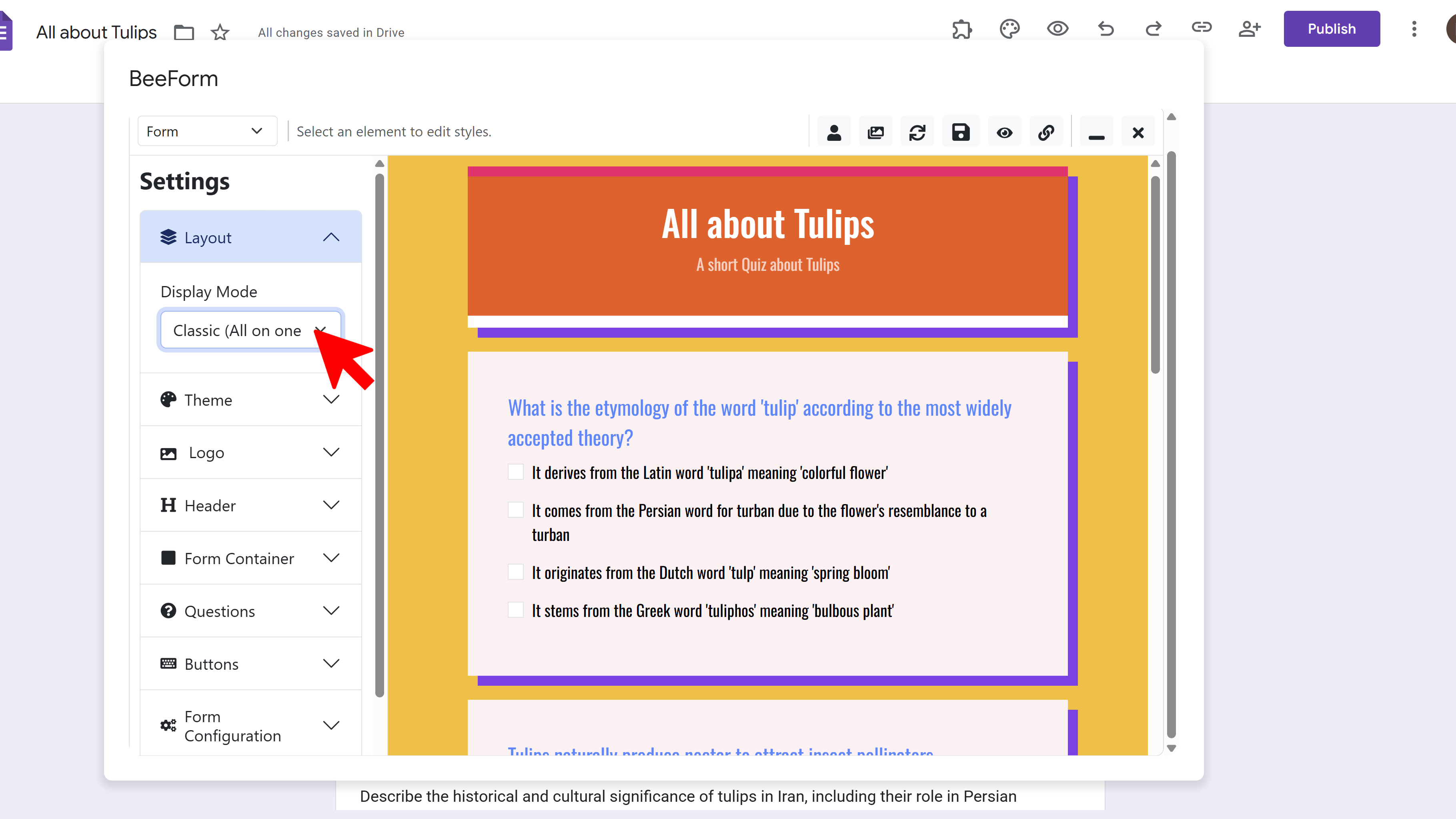
🧙 Wizard Mode
Presents one question at a time in a step-by-step format, ideal for long surveys, complex applications, or forms where you want to reduce cognitive load and guide users through each question.
Wizard Mode Features:
- Progress Bar: Shows users how far along they are (e.g., 'Question 3 of 10')
- Auto Navigation: Adds Next, Back, and Skip buttons automatically
- Better Focus: Respondents concentrate on one question at a time
- Mobile Friendly: Reduces scrolling on small screens
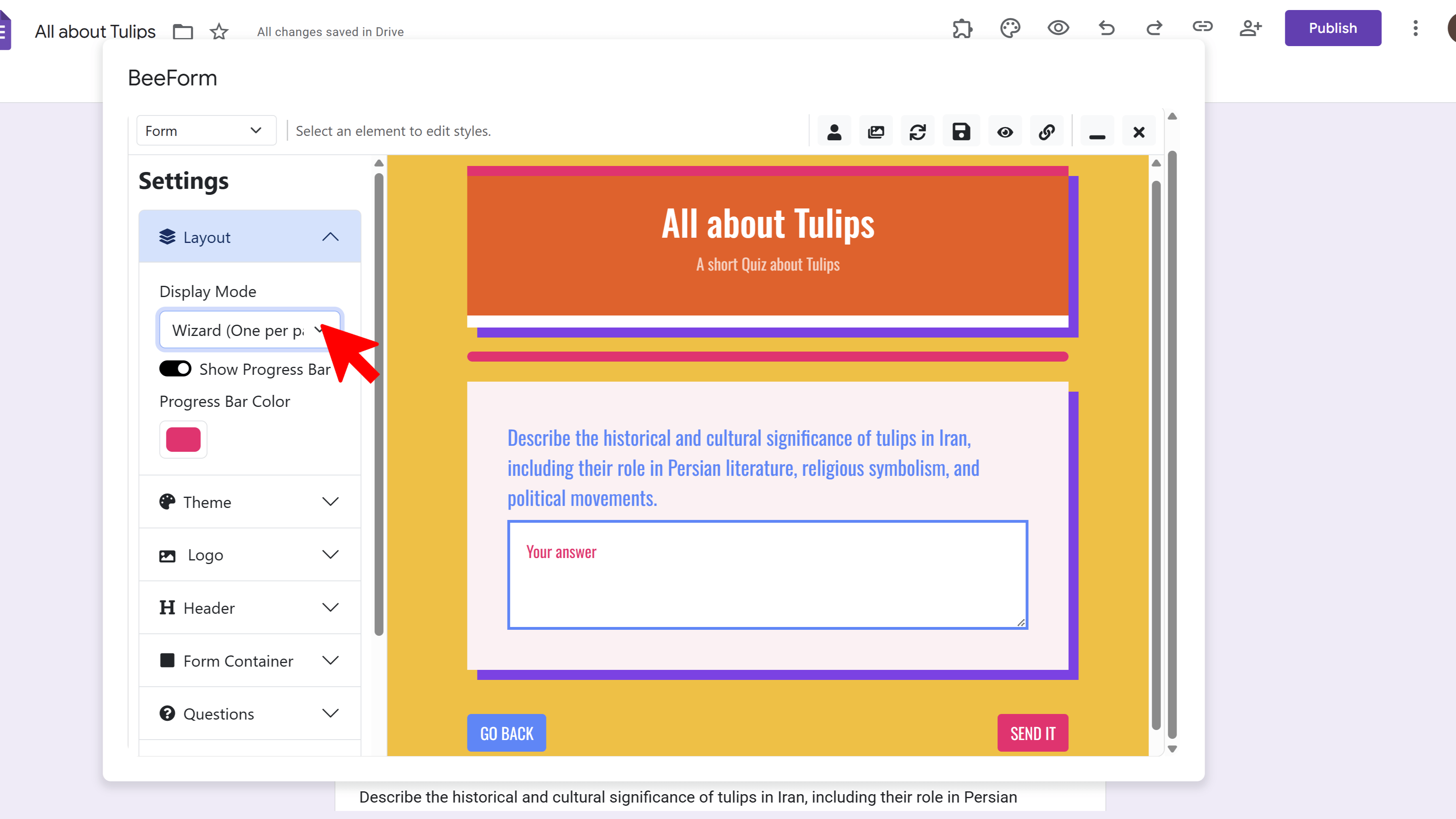
To switch modes: Navigate to Layout in the Settings Panel and select either Classic or Wizard mode. The preview updates instantly so you can see the difference.
Step 6: Setup Form Settings
Beyond visual design, BeeForm offers powerful behavioral features to manage responses and notifications:
🛑 Response Limits
Control how many responses your form can receive. Perfect for limited-capacity events, exclusive offers, or first-come-first-served registrations.
- Navigate to Response Limits settings
- Toggle Enable Response Limit to ON
- Enter Max Responses (e.g., 50 for 'First 50 registrants')
- Once the limit is reached, the form automatically closes and displays your custom 'Form Closed' message
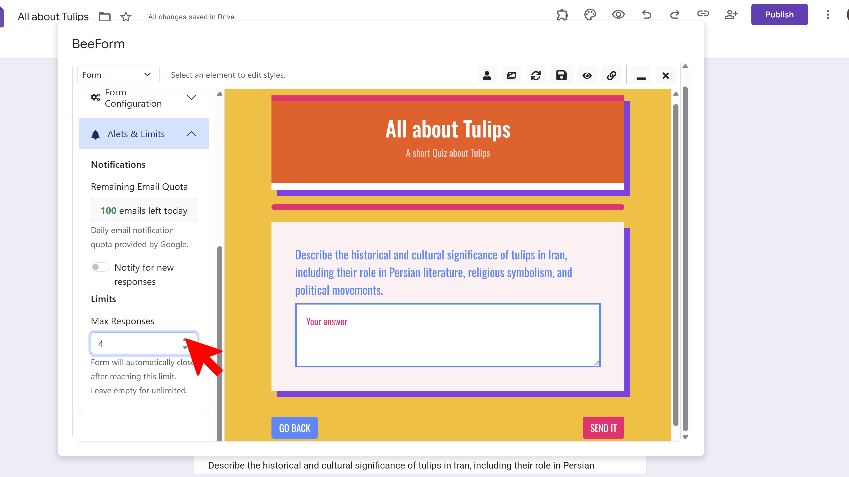
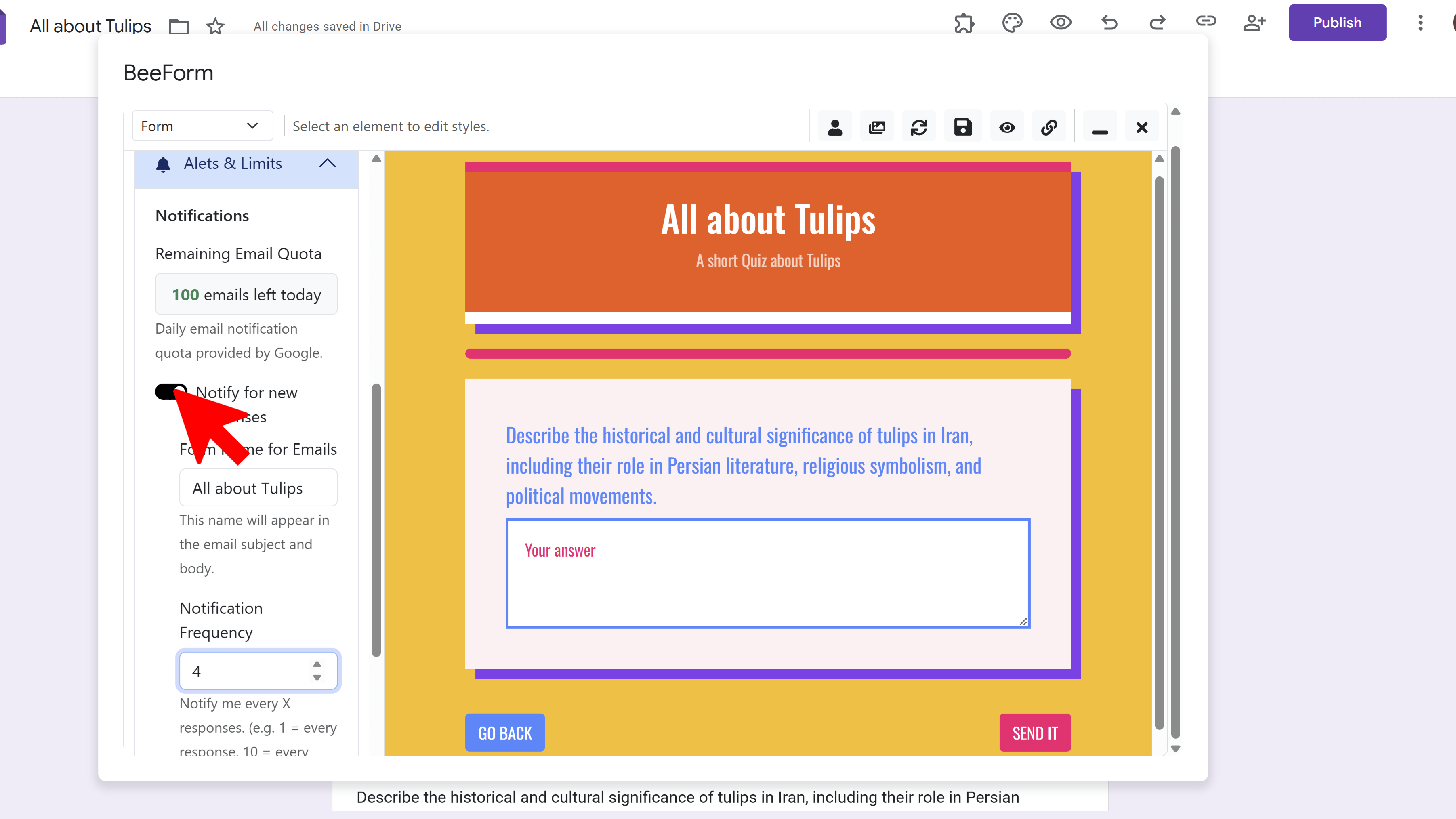
📧 Email Notifications
Get notified when someone submits your form, with customizable frequency and detailed response summaries including file uploads.
- Navigate to Email Notifications
- Toggle Enable Notifications to ON
- Choose notification frequency:
- Immediate: Email for every single response
- Every 10 responses: Batch summary
- Every 50 responses: Batch summary
- Every 100 responses: Batch summary
- Emails include response details and direct links to any uploaded files
📝 Custom Messages
Personalize the messages respondents see after submitting or when the form is closed:
Confirmation Page:
- Shown immediately after a successful form submission
- Default: 'Thank you for your submission!' — customize to add next steps, contact information, or appreciation
- Example: 'Thanks! We'll contact you within 24 hours.'
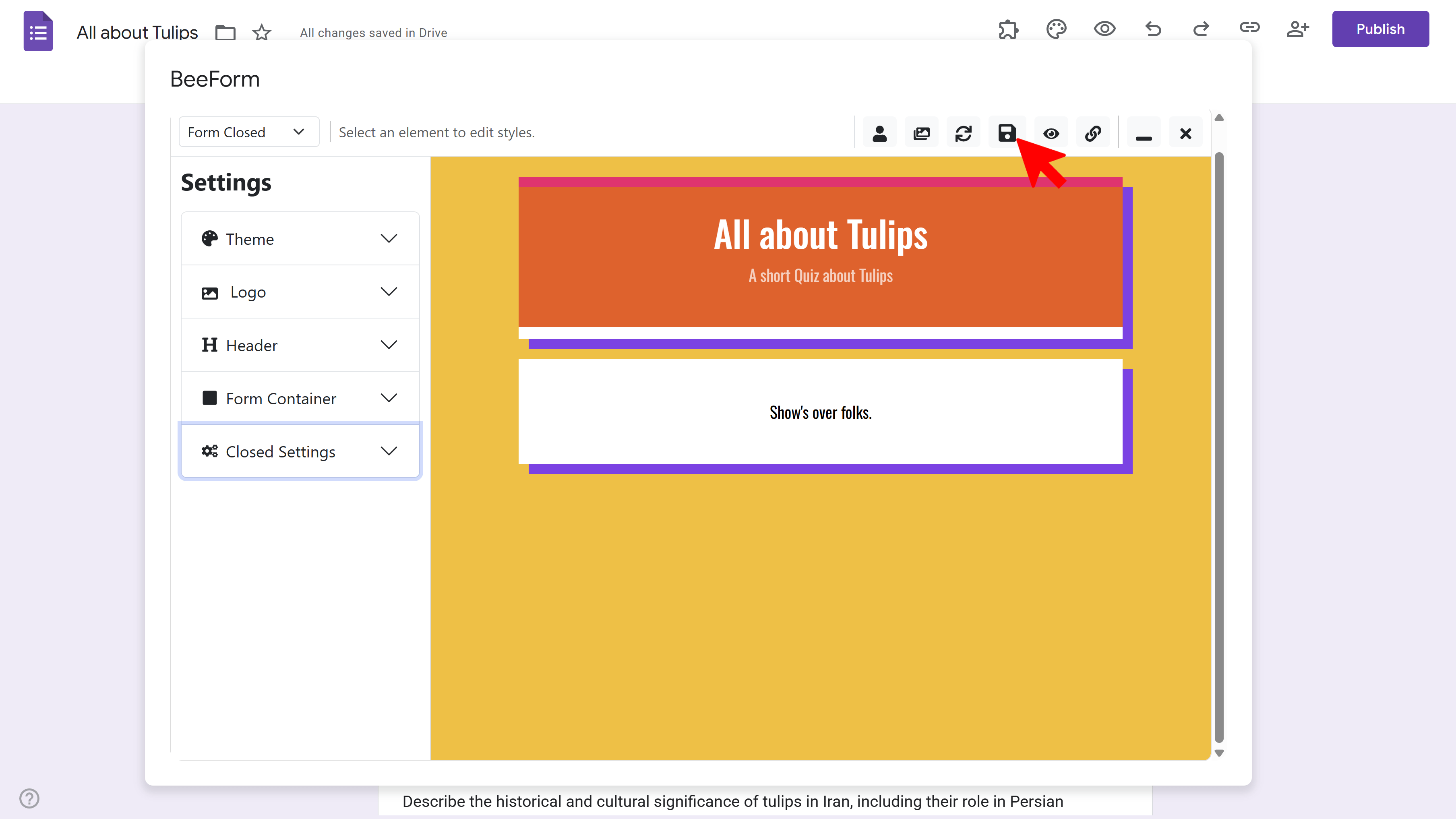
Form Closed Page:
- Shown when someone tries to access a closed form (response limit reached or manually closed)
- Default: 'This form is no longer accepting responses.' — customize to provide alternatives or future availability
- Example: 'Registration is full! Join our waitlist at [email address].'
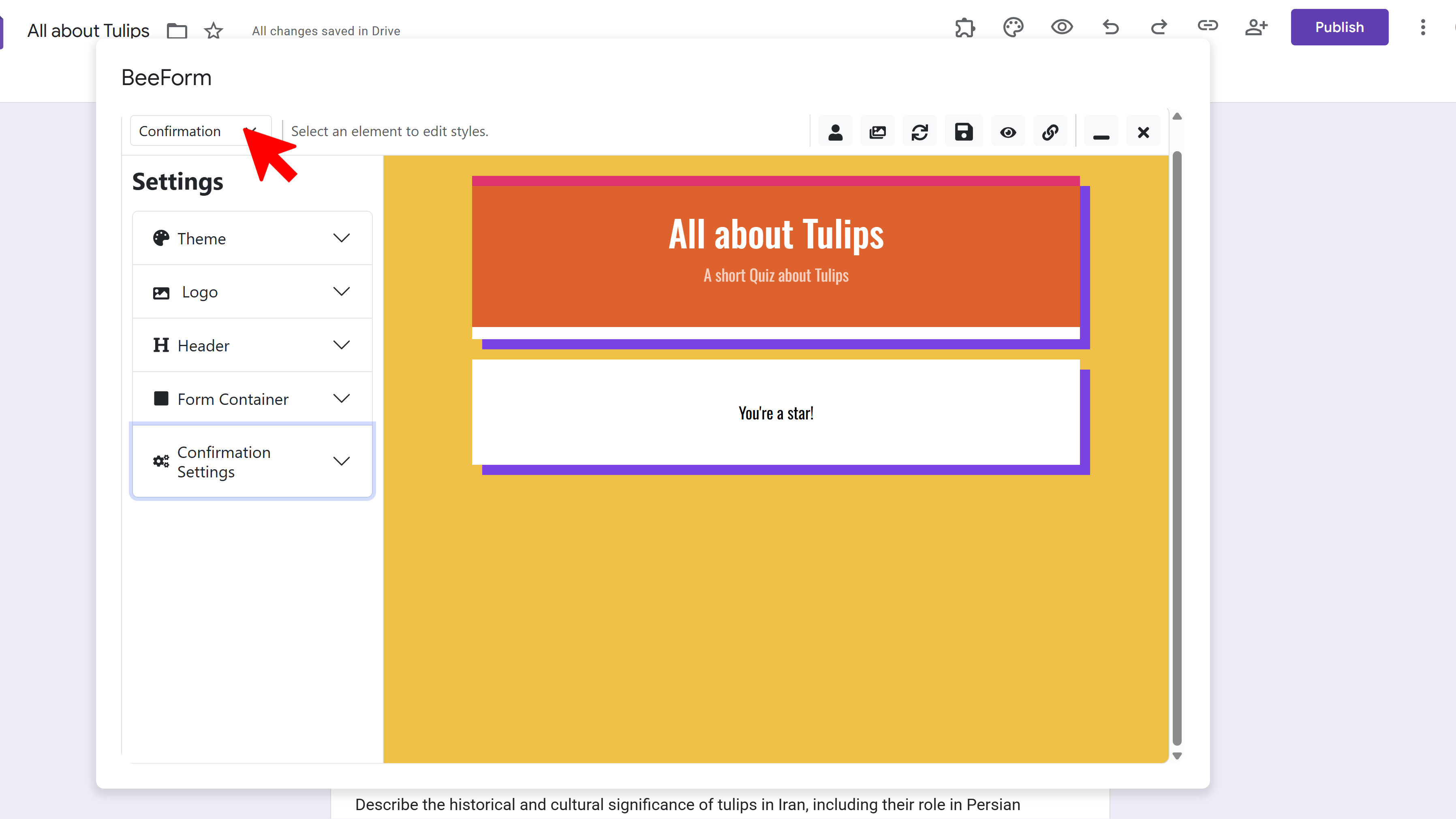
Pro Tip: Use the View Selector in the toolbar to switch between editing the Form, Confirmation Page, and Form Closed Page to see exactly how each looks.
Step 7: Save & Publish Your Form
Once you're satisfied with your design and settings, it's time to save and share your beautiful form with the world.
💾 Save Your Design
- Click the Save icon (floppy disk) in the toolbar
- Wait for the spinner to stop this saves all your settings to the Google Form
- You'll see a confirmation message when save is complete
🔗 Get Your Shareable Link
- Click the Link icon in the toolbar
- A modal appears with your unique BeeForm URL (this is different from your standard Google Form link)
- Click Copy to save the link to your clipboard
- Share this link via email, social media, embed on your website, or include in QR codes
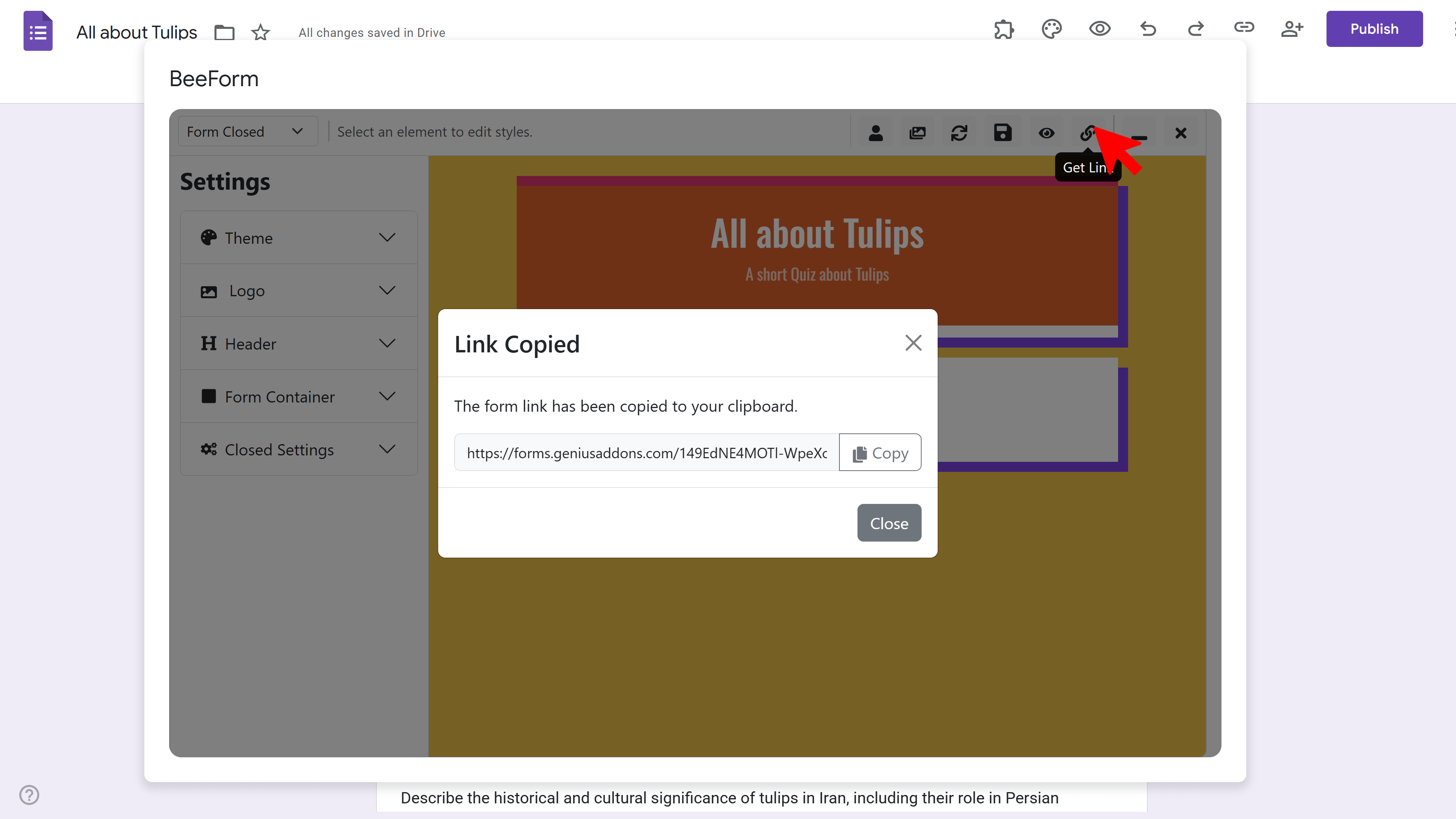
Important: Use the BeeForm link (not the standard Google Form link) to show respondents your custom design. Responses submitted through either link will appear in the same place your Google Form's 'Responses' tab and linked Google Sheet.
👁️ Preview Before Publishing
Want to test the full user experience? Click the Eye icon in the toolbar to open a live preview in a new tab. This shows exactly what respondents will see, including all styling, layout, and behavior settings.
Create Beautiful Forms with BeeForm

FAQ – How to Use BeeForm
Do I need to know how to code to use BeeForm?
No. BeeForm is a completely visual designer with point-and-click controls. No HTML, CSS, or JavaScript knowledge is required. The live preview shows you exactly how changes will look in real-time.
Will responses still go to my Google Form?
Yes! BeeForm is just a beautiful front-end for your Google Form. All responses submitted through the BeeForm link are saved to your original Google Form's Responses tab and any linked Google Sheets, exactly as if they were submitted through the standard form.
Can I edit the form questions in BeeForm?
No. To add, remove, or edit questions, use the standard Google Forms editor. BeeForm focuses on design and presentation. After making changes in Google Forms, click the Refresh button in the BeeForm toolbar to update the preview.
Can I use BeeForm for existing Google Forms?
Absolutely! Install BeeForm, open any existing Google Form, and launch the Designer. Your current questions will appear in the preview, ready to be styled and customized.
What happens if I reach my response limit?
The form automatically closes and displays your custom 'Form Closed' message. New visitors cannot submit responses. You can manually re-open the form or increase the limit in BeeForm settings.
Can multiple people collaborate on designing a form?
The Google Form itself supports collaboration (multiple editors), but BeeForm design settings are saved per form. For team workflows, consider the Team or Enterprise plan which includes collaboration features and shared team libraries.